Ruby Whittaker did not set out to design pub signs. She started in websites, and kept print at arm’s length on purpose.
“I liked the fact that with a website, if something was not quite right, you could change it,” she says. “Once something was printed, or even worse made into a sign, it felt much more permanent.”
Then clients started asking for logos to go with their websites. The logos went onto menus, posters and in-house marketing, and eventually onto swing signs and external signage. That was the point the work left the screen and had to hold its own on the front of a building.
Twenty years later, the sign is the part she is drawn to.
“It is so visible and public, but it also carries so much history with it,” she says.
Ruby works with her husband Scott at WithPencils, a Nottingham-based design studio working across hospitality. He ran bars, pubs, clubs and restaurants before he moved into design, and the pair met in the pub he was working in. The studio covers branding, logos, pub signs, signage schemes, menus, campaign work, digital assets and architectural visuals, working with independents, breweries, pub companies and larger estates. Ruby handles identity, tone of voice and illustration. Scott takes on the visuals, 3D and exterior work.

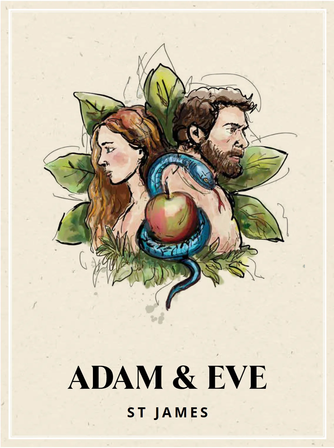
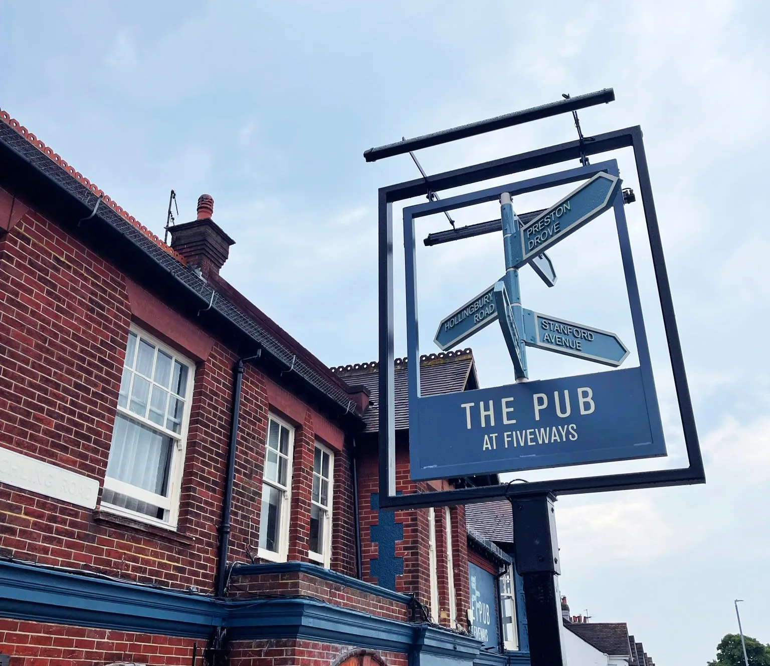
A small space with a lot of work to do
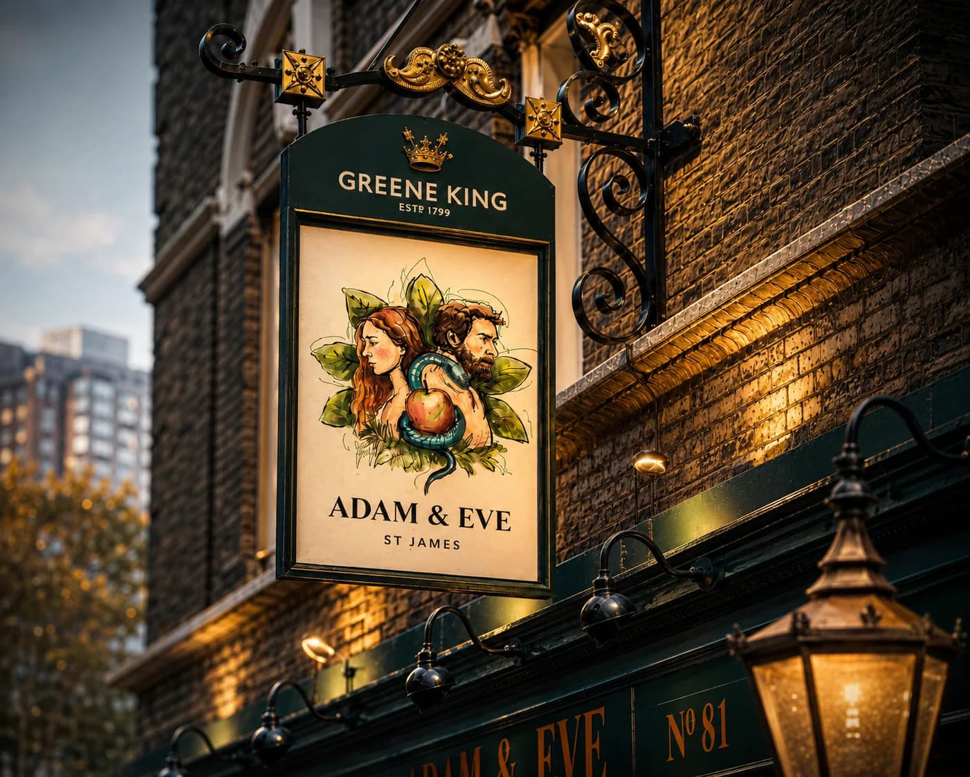
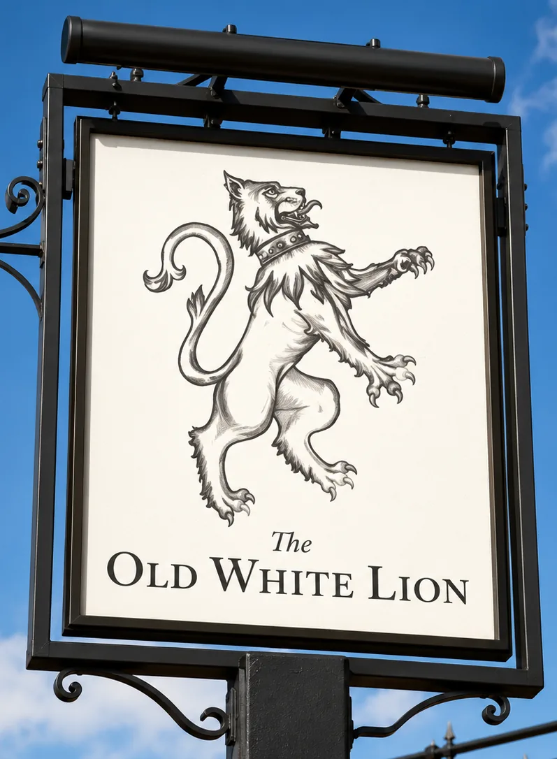
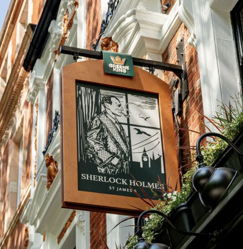
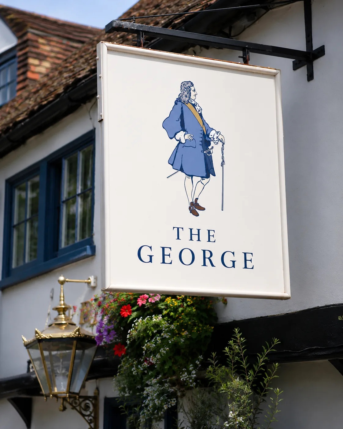
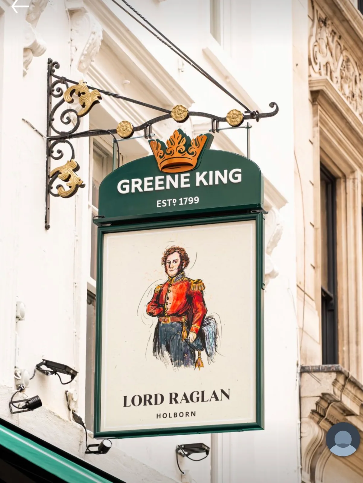
“A pub sign has to do a lot in one small space,” Ruby says. “It has to tell you the name of the pub, give you a feeling for the place, hint at the offer, stand out on the building, and be memorable enough that people recognise it again. It also has to avoid being confused with other local pubs.”
She thinks of them as book covers.
“They are a similar kind of shape and space, and in a way they are doing a similar job. They are asking: what is inside? What sort of world are you about to step into? A good book cover makes you want to pick it up. A good pub sign should make you want to walk in.”
Before a customer has read a menu or pushed a door, she says, the sign should already have told them whether the pub is traditional, food-led, premium, lively or cosy.
Signs fall flat, in her view, when they could have come from anywhere.
“That might be because the image is too obvious, or the typography does not suit the building, or it looks like it could belong to any pub in any town,” she says. “Pub signs need to have character, but they also need restraint.”
There is a practical test as well. A sign has to be read from the road and in bad light, then shrink down onto menus, pump clips, websites and social media.
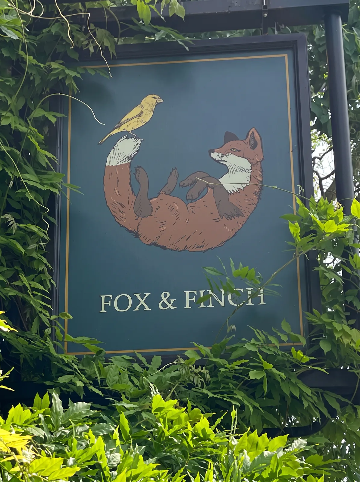
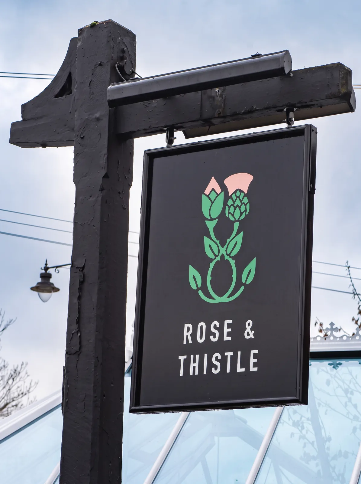
Starting with the building
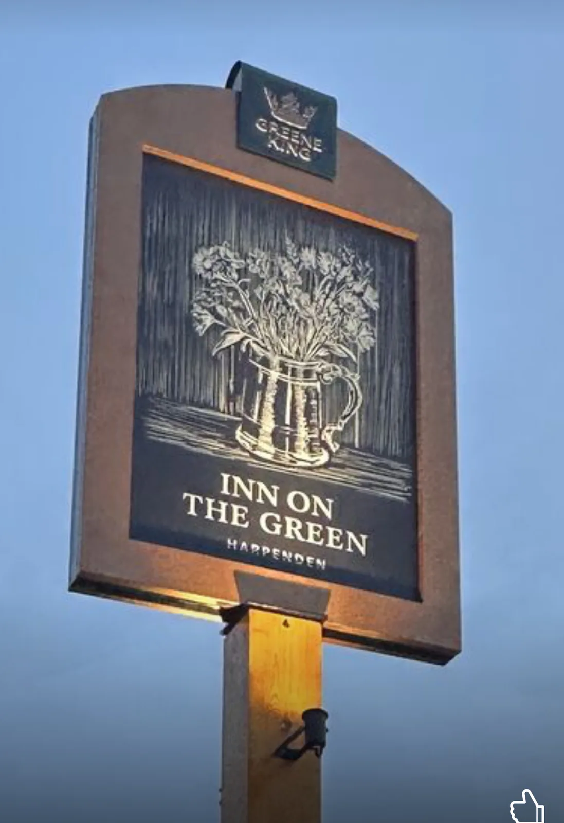
Ruby begins with the pub rather than the logo: the name, the building, the location, old photographs, maps, local history, previous signs and any stories attached to the site.
“Sometimes the name has a very obvious meaning, but often there is more going on once you start digging,” she says.
The building counts for as much as the name. What period is it, what materials are there, does the pub sit on a high street, a village green or a corner plot, and will the sign be seen up close or from passing traffic.
Only then does she sketch, usually in several directions at once. The answer might be a pictorial sign, a crest, a monogram, an animal, an object, or something much simpler.
“The important thing is that it does not feel like a logo that has just been placed above a door,” she says. “It needs to feel as though it makes sense for that pub.”
The Spaniards Inn
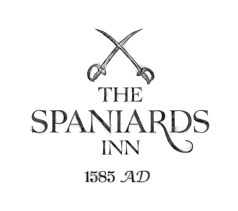
One job she returns to is The Spaniards Inn in Hampstead, one of London’s oldest pubs, built in 1585 on the edge of Hampstead Heath and bound up with stories of highwaymen, smugglers and literary visitors. Ruby designed the logo around 2014, and it went onto the side of the building a little later.
She made it look slightly smudged and worn in.
“So it felt more like something that had always been part of the pub rather than a brand-new sign,” she says.
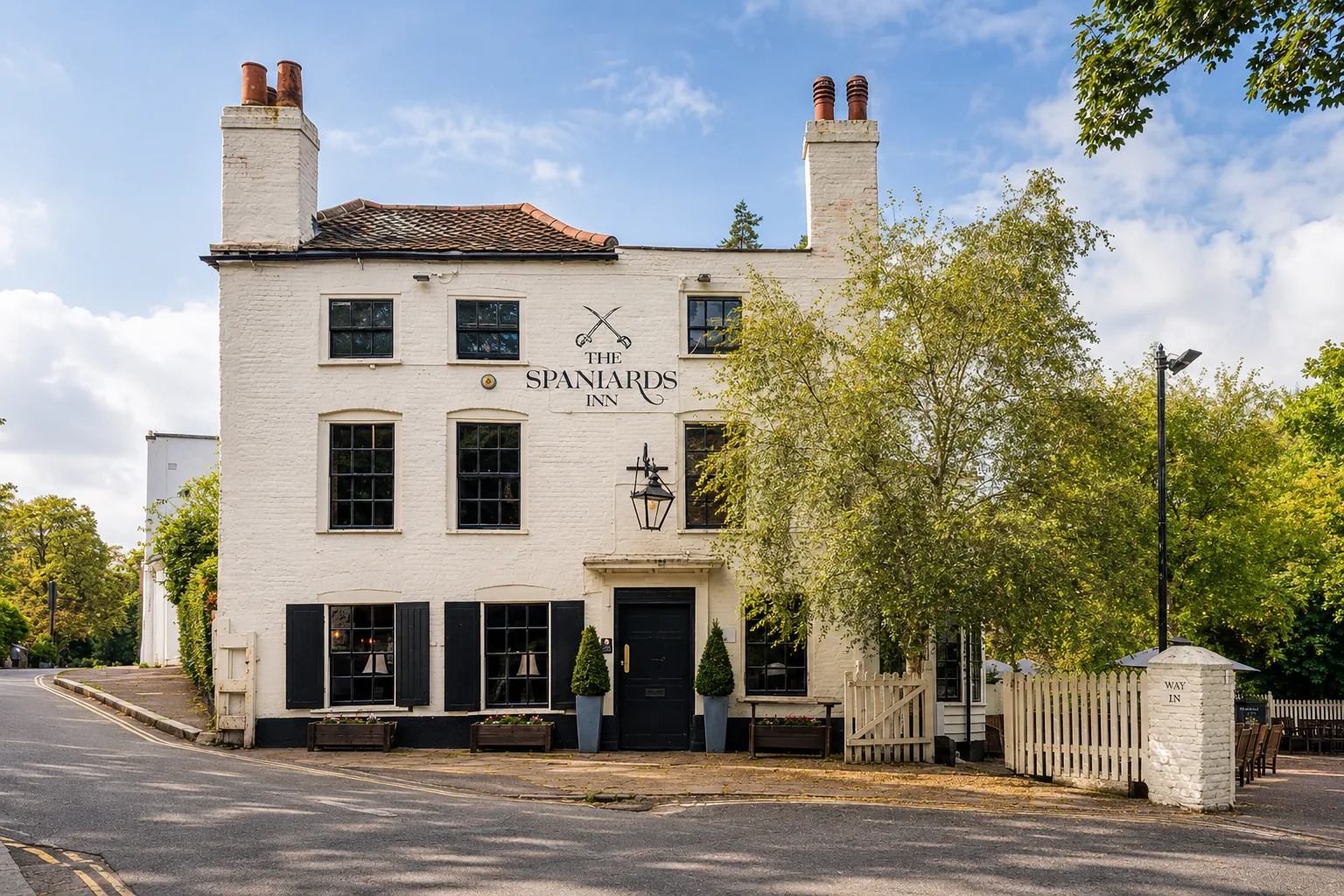
The jobs she rates most are the ones where the research goes somewhere unexpected: local stories, old industries, historic figures, myths and small details that give a sign more to say.
“The ones I am most proud of are usually the ones that feel as if they could not really belong anywhere else.”
The Instagram years
Ruby is reluctant to write off any era of pub branding.
“I don’t think any era simply damaged pub signs. It is all part of fashion and the evolution of pubs, and that is one of the things I find so exciting about the industry.”
Pressed, she points to the stretch when pubs borrowed too heavily from other sectors.
“I think the period where pubs were trying too hard to look like coffee shops, spas or lifestyle brands probably did the least for the great British pub sign,” she says. “Around ten years ago, we started seeing a lot of references from Instagram that looked lovely in other sectors, but they just were not very pub.”
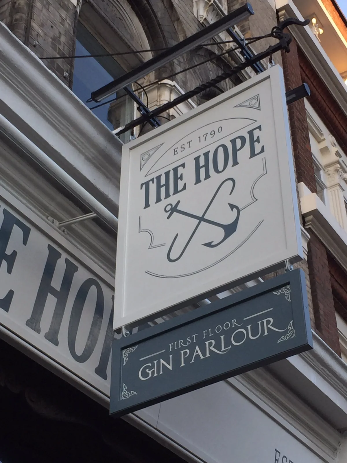
Before that came the off-the-shelf heritage era: stock crowns, shields, scrolls and Olde English typefaces that gave the impression of history without much real connection to the building or the place.
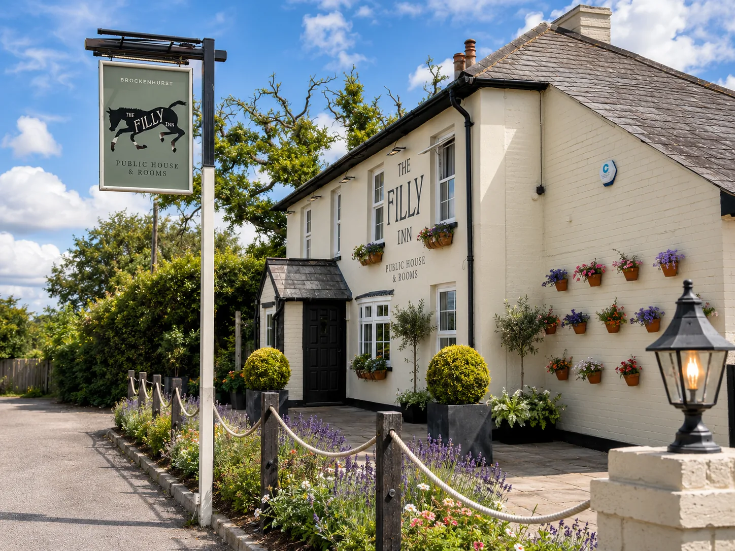
Every era left something useful behind, she says. The gastropub years brought care and atmosphere into pub branding. Craft beer brought energy, humour and illustration. Social media forced identities to become clearer and to work at small scale.
“I don’t think simple is bad. Some simple pub identities are beautiful,” she says. “The problem is when simplicity becomes sameness.”
The AI question
A logo can now be generated in seconds. Ruby is not against the technology and uses it for mood, composition and early ideas. Her argument is that the image was never the hard part.
“It is not just about generating a lion, a horse or a crown,” she says. “It is deciding what kind of image is right for that pub: the mood, the period, the level of detail, how it sits with the building, and whether it feels authentic.”
She compares it to photography, where the same subject handed to different people produces very different pictures depending on what each of them chooses to leave out.
“As humans, we understand the difference between a pub and a bar almost immediately, even if we can’t always explain it,” she says. “AI may understand the words, but it does not always understand the feeling behind them.”
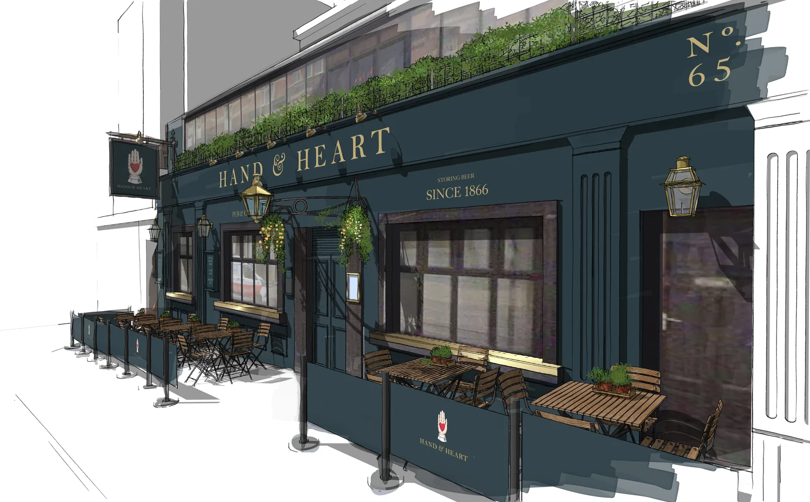
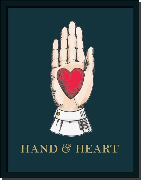
Hand-drawn work carries decisions in it, she says. “You can feel that someone has looked, thought, reduced, exaggerated and chosen what matters.”
Does branding keep a pub open?
Not on its own, Ruby says.
“The offer has to be right, the team has to be good, the food and drink have to work, and the pub has to be run well.”
It still earns its keep. It helps people work out what a pub is and why they should choose it, makes the outside of the building work harder, and pulls the menus, signage, website and social media into line.
“For pubs, familiarity is important. People like to know what they are walking into,” she says. “But they also want a reason to go somewhere rather than stay at home. Good branding helps create that reason.”
What comes next
Ruby’s prediction is that the full pictorial sign, drawn by hand across the whole canvas, is on its way back.
“I think people are tired of everything looking too perfect and too similar,” she says.
She points out that pub signs started life as signals for people who could not read. They had to be seen, understood and remembered.
“I think the full pictorial sign is a reference back to that tradition. Less about being overly clever or humorous, and more about a proper interpretation of the pub name and the place.”
The revival is not nostalgia, she says, but an answer to the thing off-the-shelf branding and AI struggle to produce: a sense of place, a story, a bit of oddness, and a human hand.
“The next great era of pub signage will hopefully be more confident, more illustrative and more specific,” she says. “Signs that are researched, drawn properly, and made to feel part of the pub rather than just applied to it.”
Her advice to any operator about to rebrand is to start with what the pub really is, before deciding what the logo should look like.
“Do not start with what you want the logo to look like. Start with what the pub really is,” she says. “Who is it for? Why do people come? What is the building telling you? What is the local history? What should someone feel before they walk through the door?”
“A good pub identity should not feel like it has been put on top of a pub. It should feel like it has grown out of it. That is where the best signs come from.”
Ruby Whittaker is a partner at WithPencils, a design studio working across the hospitality industry: withpencils.com